
Appearance
Dimensions Control
Elementor Core Basic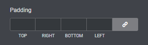
Elementor dimensions control displays a input fields for top, right, bottom, left and the option to link them together. The dimensions control can optionally have a number of unit types (size_units) for the user to choose from. The control also accepts a range argument that allows you to set the min, max and step values per unit type.
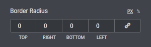
The control is defined in Control_Dimensions class which extends Control_Base_Units class.
When using this control, the type should be set to \Elementor\Controls_Manager::DIMENSIONS constant.
Arguments
| Name | Type | Default | Description |
|---|---|---|---|
type | string | dimensions | The type of the control. |
label | string | The label that appears above of the field. | |
description | string | The description that appears below the field. | |
show_label | bool | true | Whether to display the label. |
label_block | bool | true | Whether to display the label in a separate line. |
separator | string | default | Set the position of the control separator. Available values are default, before and after. default will hide the separator, unless the control type has specific separator settings. before / after will position the separator before/after the control. |
size_units | array | [ 'px' ] | An array of available CSS units like px, em, rem, %, deg, vh or custom. |
default | array | Default slider value.
| |
placeholder | array | The field placeholder that appears when the field has no values.
|
Return Value
[
	'top' => '',
	'right' => '',
	'bottom' => '',
	'left' => '',
	'unit' => '',
	'isLinked' => '',
](array) An array containing the dimension values:
- $top (
int) Top dimension. - $right (
int) Right dimension. - $bottom (
int) Bottom dimension. - $left (
int) Left dimension. - $unit (
string) The CSS unit type. - $isLinked (
bool) Whether to link all the values together or not.
Usage
php
<?php
class Elementor_Test_Widget extends \Elementor\Widget_Base {

	protected function register_controls(): void {

		$this->start_controls_section(
			'style_section',
			[
				'label' => esc_html__( 'Style', 'textdomain' ),
				'tab' => \Elementor\Controls_Manager::TAB_STYLE,
			]
		);

		$this->add_control(
			'margin',
			[
				'label' => esc_html__( 'Margin', 'textdomain' ),
				'type' => \Elementor\Controls_Manager::DIMENSIONS,
				'size_units' => [ 'px', '%', 'em', 'rem', 'custom' ],
				'default' => [
					'top' => 2,
					'right' => 0,
					'bottom' => 2,
					'left' => 0,
					'unit' => 'em',
					'isLinked' => false,
				],
				'selectors' => [
					'{{WRAPPER}} .your-class' => 'margin: {{TOP}}{{UNIT}} {{RIGHT}}{{UNIT}} {{BOTTOM}}{{UNIT}} {{LEFT}}{{UNIT}};',
				],
			]
		);

		$this->end_controls_section();

	}

	protected function render(): void {
		$settings = $this->get_settings_for_display();
		?>
		<div class="your-class">
			...
		</div>
		<?php
	}

	protected function content_template(): void {
		?>
		<div class="your-class">
			...
		</div>
		<?php
	}

}